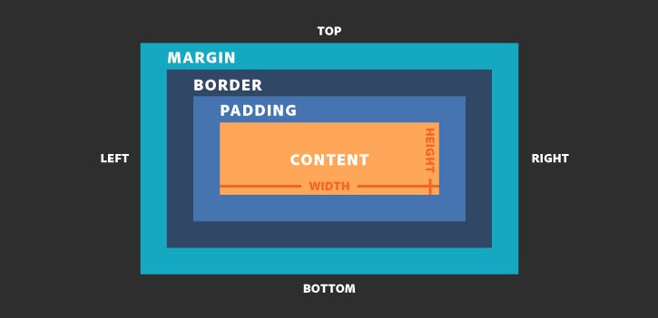
Box Model
Box model means that everything in CSS is a represented as box and will be formatted as a model. Each element will have their own box. In nested elements scenario every box is placed withing boxes.

Content
Content area consist of content like image, text or other forms of media content. We can change box dimensions using height and width property.
Padding
The padding area is the space around the content area and within the border-box. It can be applied to all sides of the box or to the specific, selected side(s) - top, right, bottom, and/or left.
Border
The border area surrounds the padding and the content. Border can be applied to all the sides of the box or to selected side - top, right, bottom, and/or left.
Margin
Clears an area outside the border. The margin is transparent. Margin can be applied to all the sides of the box or to selected side - top, right, bottom, and/or left.
box-sizing
By using box-sizing property we can decide elements padding and border will be included with height and width property of element or not.
As per below example we can see that both box have same height and width property but still one box looks larger then another box. This happens because by default css box-model calculates height and width of any element as below.
width + padding + border = rendered or displayed width of the element's box.
height + padding + border = rendered or displayed height of the element's box.
We can solve this is issue by setting box-sizing property value to border-box as shown in below example.
syntax
      .box{
           box-sizing :content-box / border-box;
      }
content-box
This is default value of box-sizing property. It will not include border and padding to actual height and width of element. This mean if we set width:200px and give border to 5px and padding to 10px then width will be greater than 200px;
border-box
When we set box-sizing property to border-box then height and width value will include content, padding and border too. This mean if we set width:200px and give border to 5px and padding to 10px then content will shrink to absorb that extra width and actual width will be same 200px;
